コーススケジュール
Bootstrap を使用してテーブル スタイルを選択するためのドキュメントと例 (JavaScript プラグインで広く使用されているため)。
1. 例
カレンダーや日付ピッカーなどのサードパーティ ウィジェットでテーブルが広く使用されているため、テーブルを選択できるように設計しました。基本クラスを.tableany に追加し<table>、カスタム スタイルや含まれているさまざまなデコレータ クラスで拡張するだけです。
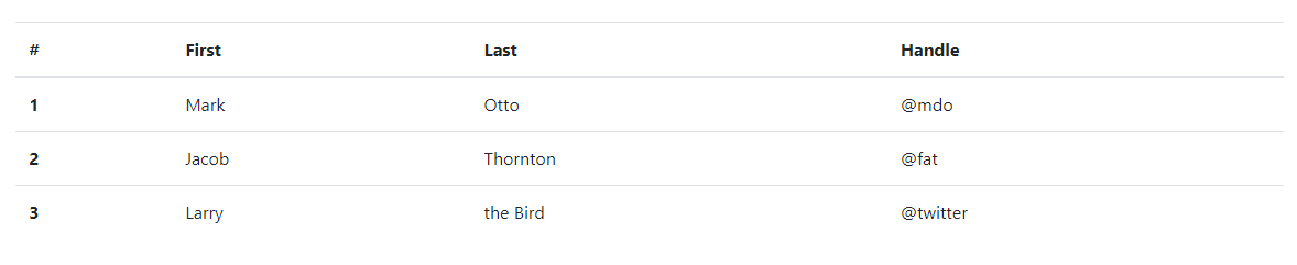
最も基本的なテーブル マークアップを使用すると、.tableBootstrap に基づくテーブルは次のようになります。すべてのテーブル スタイルは Bootstrap 4 に継承されます。つまり、ネストされたテーブルは親テーブルと同じ方法でスタイル設定されます。
<table class="table">
  <thead>
    <tr>
      <th scope="col">#</th>
      <th scope="col">First</th>
      <th scope="col">Last</th>
      <th scope="col">Handle</th>
    </tr>
  </thead>
  <tbody>
    <tr>
      <th scope="row">1</th>
      <td>Mark</td>
      <td>Otto</td>
      <td>mdo</td>
    </tr>
    <tr>
      <th scope="row">2</th>
      <td>Jacob</td>
      <td>Thornton</td>
      <td>fat</td>
    </tr>
    <tr>
      <th scope="row">3</th>
      <td>Larry</td>
      <td>the Bird</td>
      <td>twitter</td>
    </tr>
  </tbody>
</table>
効果は次の図に示すとおりです。
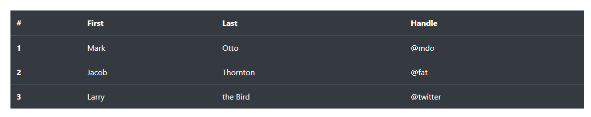
.table-darkを使用して、暗い背景上の明るいテキストの色を反転することもできます。
<table class="table table-dark">
  <thead>
    <tr>
      <th scope="col">#</th>
      <th scope="col">First</th>
      <th scope="col">Last</th>
      <th scope="col">Handle</th>
    </tr>
  </thead>
  <tbody>
    <tr>
      <th scope="row">1</th>
      <td>Mark</td>
      <td>Otto</td>
      <td>mdo</td>
    </tr>
    <tr>
      <th scope="row">2</th>
      <td>Jacob</td>
      <td>Thornton</td>
      <td>fat</td>
    </tr>
    <tr>
      <th scope="row">3</th>
      <td>Larry</td>
      <td>the Bird</td>
      <td>twitter</td>
    </tr>
  </tbody>
</table>
効果は次の図に示すとおりです。
2. ヘッダーオプション
テーブルやダークテーブルと同様に、修飾子クラスを使用する. head-lightか、 を明るい灰色または暗い灰色で表示し. head-darkます。< head>
<table class="table">
  <thead class="thead-dark">
    <tr>
      <th scope="col">#</th>
      <th scope="col">First</th>
      <th scope="col">Last</th>
      <th scope="col">Handle</th>
    </tr>
  </thead>
  <tbody>
    <tr>
      <th scope="row">1</th>
      <td>Mark</td>
      <td>Otto</td>
      <td>mdo</td>
    </tr>
    <tr>
      <th scope="row">2</th>
      <td>Jacob</td>
      <td>Thornton</td>
      <td>fat</td>
    </tr>
    <tr>
      <th scope="row">3</th>
      <td>Larry</td>
      <td>the Bird</td>
      <td>twitter</td>
    </tr>
  </tbody>
</table>

<table class="table">
  <thead class="thead-light">
    <tr>
      <th scope="col">#</th>
      <th scope="col">First</th>
      <th scope="col">Last</th>
      <th scope="col">Handle</th>
    </tr>
  </thead>
  <tbody>
    <tr>
      <th scope="row">1</th>
      <td>Mark</td>
      <td>Otto</td>
      <td>mdo</td>
    </tr>
    <tr>
      <th scope="row">2</th>
      <td>Jacob</td>
      <td>Thornton</td>
      <td>fat</td>
    </tr>
    <tr>
      <th scope="row">3</th>
      <td>Larry</td>
      <td>the Bird</td>
      <td>twitter</td>
    </tr>
  </tbody>
</table>
効果は次の図に示すとおりです。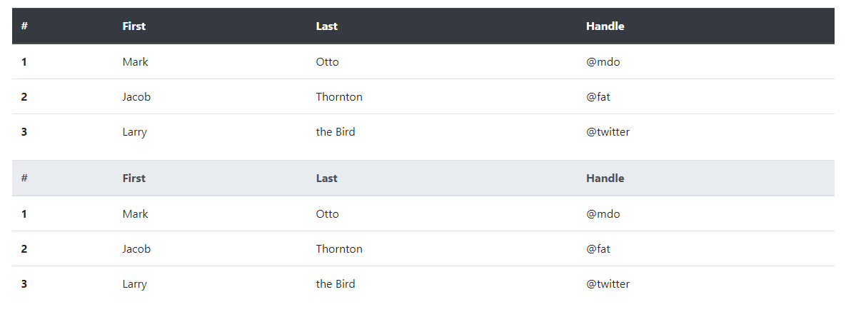
3. ストライプ列
.table-stripedにゼブラ ストライプを追加する<tbody>テーブル行を使用します。
<table class="table table-striped">
  <thead>
    <tr>
      <th scope="col">#</th>
      <th scope="col">First</th>
      <th scope="col">Last</th>
      <th scope="col">Handle</th>
    </tr>
  </thead>
  <tbody>
    <tr>
      <th scope="row">1</th>
      <td>Mark</td>
      <td>Otto</td>
      <td>mdo</td>
    </tr>
    <tr>
      <th scope="row">2</th>
      <td>Jacob</td>
      <td>Thornton</td>
      <td>fat</td>
    </tr>
    <tr>
      <th scope="row">3</th>
      <td>Larry</td>
      <td>the Bird</td>
      <td>twitter</td>
    </tr>
  </tbody>
</table>
効果は次の図に示すとおりです。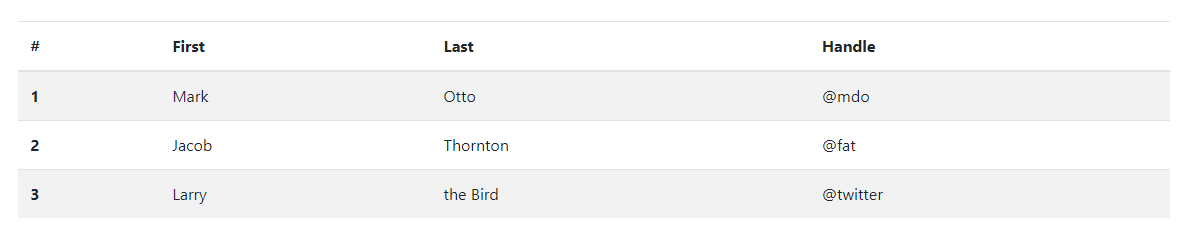
<table class="table table-striped table-dark">
  <thead>
    <tr>
      <th scope="col">#</th>
      <th scope="col">First</th>
      <th scope="col">Last</th>
      <th scope="col">Handle</th>
    </tr>
  </thead>
  <tbody>
    <tr>
      <th scope="row">1</th>
      <td>Mark</td>
      <td>Otto</td>
      <td>mdo</td>
    </tr>
    <tr>
      <th scope="row">2</th>
      <td>Jacob</td>
      <td>Thornton</td>
      <td>fat</td>
    </tr>
    <tr>
      <th scope="row">3</th>
      <td>Larry</td>
      <td>the Bird</td>
      <td>twitter</td>
    </tr>
  </tbody>
</table>
効果は次の図に示すとおりです。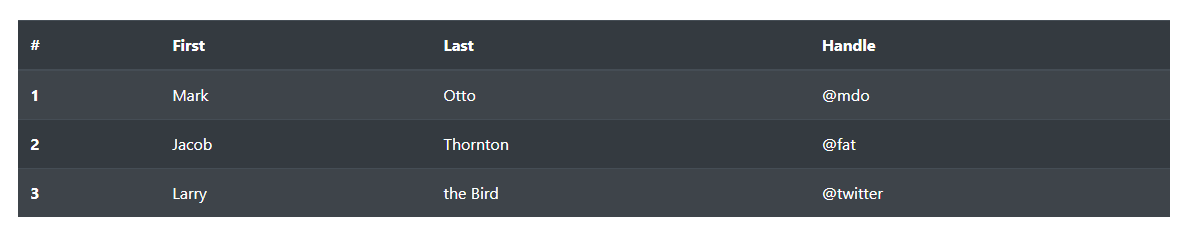
4. 表には枠線がある
表とセルのすべての側面に.table- borderded枠線を追加します。
<table class="table table-bordered">
  <thead>
    <tr>
      <th scope="col">#</th>
      <th scope="col">First</th>
      <th scope="col">Last</th>
      <th scope="col">Handle</th>
    </tr>
  </thead>
  <tbody>
    <tr>
      <th scope="row">1</th>
      <td>Mark</td>
      <td>Otto</td>
      <td>mdo</td>
    </tr>
    <tr>
      <th scope="row">2</th>
      <td>Jacob</td>
      <td>Thornton</td>
      <td>fat</td>
    </tr>
    <tr>
      <th scope="row">3</th>
      <td colspan="2">Larry the Bird</td>
      <td>twitter</td>
    </tr>
  </tbody>
</table>
効果は次の図に示すとおりです。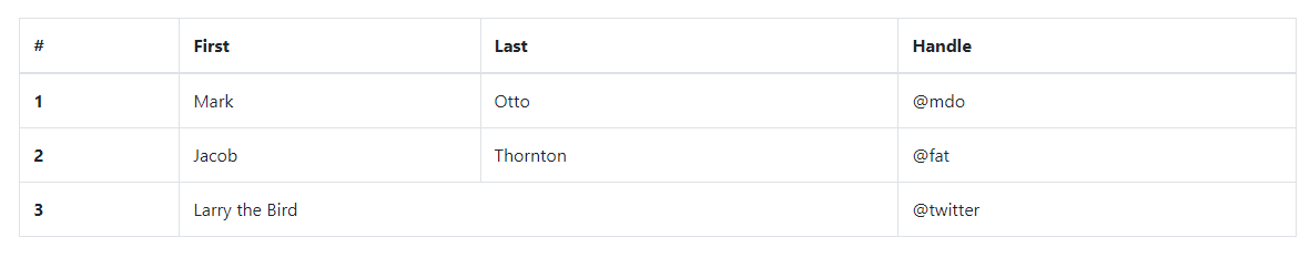
<table class="table table-bordered table-dark">
  <thead>
    <tr>
      <th scope="col">#</th>
      <th scope="col">First</th>
      <th scope="col">Last</th>
      <th scope="col">Handle</th>
    </tr>
  </thead>
  <tbody>
    <tr>
      <th scope="row">1</th>
      <td>Mark</td>
      <td>Otto</td>
      <td>mdo</td>
    </tr>
    <tr>
      <th scope="row">2</th>
      <td>Jacob</td>
      <td>Thornton</td>
      <td>fat</td>
    </tr>
    <tr>
      <th scope="row">3</th>
      <td colspan="2">Larry the Bird</td>
      <td>twitter</td>
    </tr>
  </tbody>
</table>
効果は次の図に示すとおりです。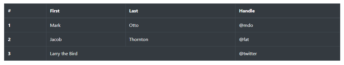
5. テーブルには枠線がない
ボーダーレステーブル用に追加されました.table-borderless。
<table class="table table-borderless">
  <thead>
    <tr>
      <th scope="col">#</th>
      <th scope="col">First</th>
      <th scope="col">Last</th>
      <th scope="col">Handle</th>
    </tr>
  </thead>
  <tbody>
    <tr>
      <th scope="row">1</th>
      <td>Mark</td>
      <td>Otto</td>
      <td>mdo</td>
    </tr>
    <tr>
      <th scope="row">2</th>
      <td>Jacob</td>
      <td>Thornton</td>
      <td>fat</td>
    </tr>
    <tr>
      <th scope="row">3</th>
      <td colspan="2">Larry the Bird</td>
      <td>twitter</td>
    </tr>
  </tbody>
</table>
効果は図のようになります。
.table-borderless暗いテーブルにも使用できます。
<table class="table table-borderless table-dark">
  <thead>
    <tr>
      <th scope="col">#</th>
      <th scope="col">First</th>
      <th scope="col">Last</th>
      <th scope="col">Handle</th>
    </tr>
  </thead>
  <tbody>
    <tr>
      <th scope="row">1</th>
      <td>Mark</td>
      <td>Otto</td>
      <td>mdo</td>
    </tr>
    <tr>
      <th scope="row">2</th>
      <td>Jacob</td>
      <td>Thornton</td>
      <td>fat</td>
    </tr>
    <tr>
      <th scope="row">3</th>
      <td colspan="2">Larry the Bird</td>
      <td>twitter</td>
    </tr>
  </tbody>
</table>
効果は次の図に示すとおりです。
6. Hoverable
のテーブル行のホバー状態を有効にする.table-hoverために追加されました。<tbody>
<table class="table table-hover">
  <thead>
    <tr>
      <th scope="col">#</th>
      <th scope="col">First</th>
      <th scope="col">Last</th>
      <th scope="col">Handle</th>
    </tr>
  </thead>
  <tbody>
    <tr>
      <th scope="row">1</th>
      <td>Mark</td>
      <td>Otto</td>
      <td>mdo</td>
    </tr>
    <tr>
      <th scope="row">2</th>
      <td>Jacob</td>
      <td>Thornton</td>
      <td>fat</td>
    </tr>
    <tr>
      <th scope="row">3</th>
      <td colspan="2">Larry the Bird</td>
      <td>twitter</td>
    </tr>
  </tbody>
</table>
効果は次の図に示すとおりです。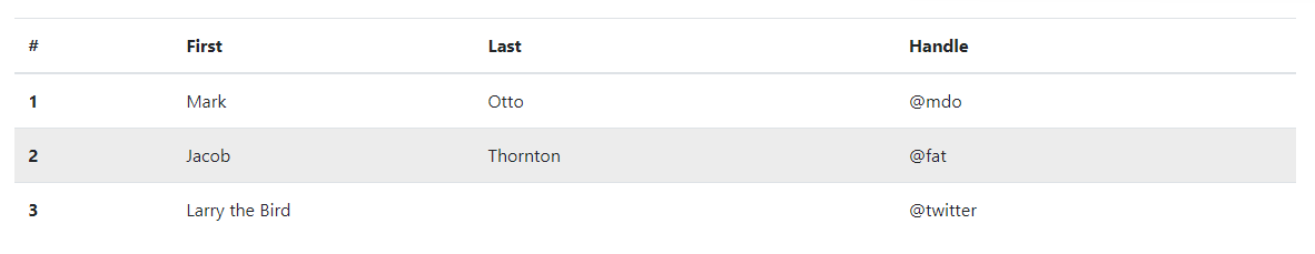
<table class="table table-hover table-dark">
  <thead>
    <tr>
      <th scope="col">#</th>
      <th scope="col">First</th>
      <th scope="col">Last</th>
      <th scope="col">Handle</th>
    </tr>
  </thead>
  <tbody>
    <tr>
      <th scope="row">1</th>
      <td>Mark</td>
      <td>Otto</td>
      <td>mdo</td>
    </tr>
    <tr>
      <th scope="row">2</th>
      <td>Jacob</td>
      <td>Thornton</td>
      <td>fat</td>
    </tr>
    <tr>
      <th scope="row">3</th>
      <td colspan="2">Larry the Bird</td>
      <td>twitter</td>
    </tr>
  </tbody>
</table>
効果は次の図に示すとおりです。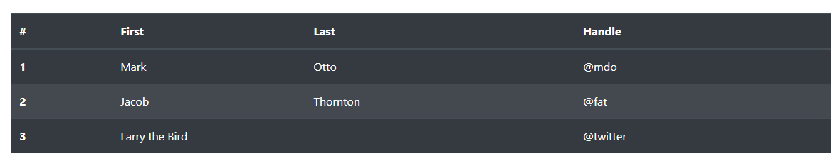
7. .table-sm
.table-smセルのパディングを半分にカットしてテーブルをよりコンパクトにするために、 を追加しました。
<table class="table table-sm">
  <thead>
    <tr>
      <th scope="col">#</th>
      <th scope="col">First</th>
      <th scope="col">Last</th>
      <th scope="col">Handle</th>
    </tr>
  </thead>
  <tbody>
    <tr>
      <th scope="row">1</th>
      <td>Mark</td>
      <td>Otto</td>
      <td>mdo</td>
    </tr>
    <tr>
      <th scope="row">2</th>
      <td>Jacob</td>
      <td>Thornton</td>
      <td>fat</td>
    </tr>
    <tr>
      <th scope="row">3</th>
      <td colspan="2">Larry the Bird</td>
      <td>twitter</td>
    </tr>
  </tbody>
</table>
効果は次の図に示すとおりです。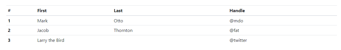
<table class="table table-sm table-dark">
  <thead>
    <tr>
      <th scope="col">#</th>
      <th scope="col">First</th>
      <th scope="col">Last</th>
      <th scope="col">Handle</th>
    </tr>
  </thead>
  <tbody>
    <tr>
      <th scope="row">1</th>
      <td>Mark</td>
      <td>Otto</td>
      <td>mdo</td>
    </tr>
    <tr>
      <th scope="row">2</th>
      <td>Jacob</td>
      <td>Thornton</td>
      <td>fat</td>
    </tr>
    <tr>
      <th scope="row">3</th>
      <td colspan="2">Larry the Bird</td>
      <td>twitter</td>
    </tr>
  </tbody>
</table>
効果は次の図に示すとおりです。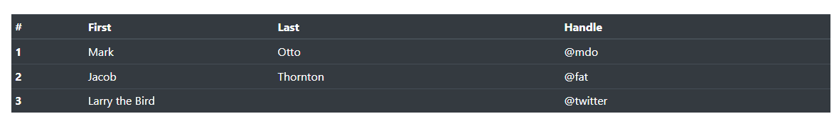
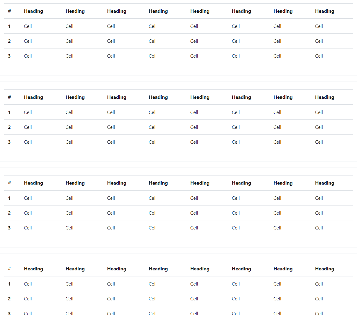
8. コンテキストクラス
コンテキスト クラスを使用して、テーブルの行または個々のセルに色を付けます。
<!-- On rows -->
<tr class="table-active">...</tr>
<tr class="table-primary">...</tr>
<tr class="table-secondary">...</tr>
<tr class="table-success">...</tr>
<tr class="table-danger">...</tr>
<tr class="table-warning">...</tr>
<tr class="table-info">...</tr>
<tr class="table-light">...</tr>
<tr class="table-dark">...</tr>

<!-- On cells (`td` or `th`) -->
<tr>
  <td class="table-active">...</td>
  <td class="table-primary">...</td>
  <td class="table-secondary">...</td>
  <td class="table-success">...</td>
  <td class="table-danger">...</td>
  <td class="table-warning">...</td>
  <td class="table-info">...</td>
  <td class="table-light">...</td>
  <td class="table-dark">...</td>
</tr>
効果は図に示されています。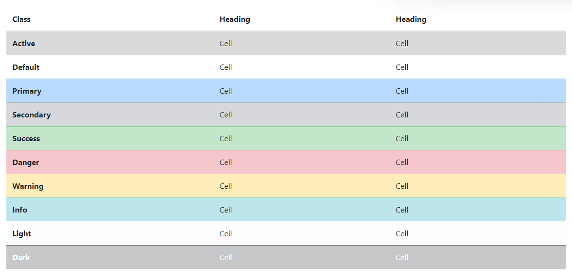
通常のテーブルの背景変数はダーク テーブルでは使用できませんが、テキスト ユーティリティまたは背景ユーティリティを使用して同様のスタイルを実現できます。
<!-- On rows -->
<tr class="bg-primary">...</tr>
<tr class="bg-success">...</tr>
<tr class="bg-warning">...</tr>
<tr class="bg-danger">...</tr>
<tr class="bg-info">...</tr>

<!-- On cells (`td` or `th`) -->
<tr>
  <td class="bg-primary">...</td>
  <td class="bg-success">...</td>
  <td class="bg-warning">...</td>
  <td class="bg-danger">...</td>
  <td class="bg-info">...</td>
</tr>
効果は次の図に示すとおりです。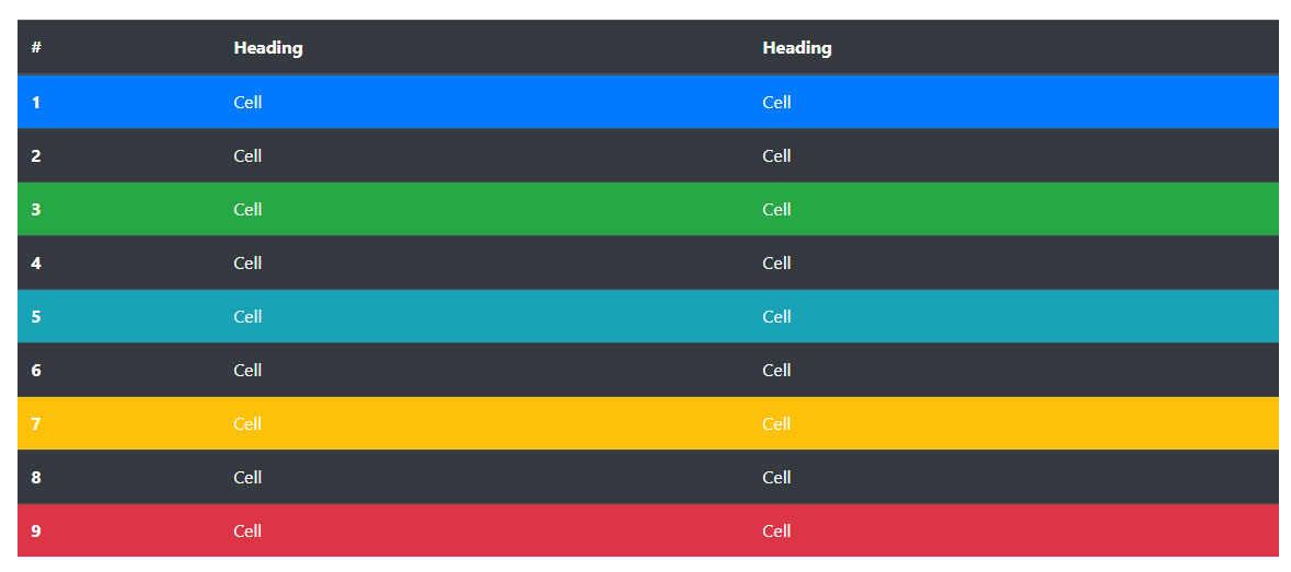
支援技術への意味の伝達
色を使用して意味を追加することは、視覚的な指示を提供するだけであり、スクリーン リーダーなどの支援技術のユーザーにはその指示が伝わりません。色で表される情報がコンテンツ自体 (表示されるテキストなど) から明らかであるか、または .sr-only クラスで隠された追加のテキストなどの他の手段によって含まれていることを確認してください。
any でパディングを使用して、テーブルをそれぞれ最大幅 576px、768px、992px、および 1120px まで (ただしこれらを含まない) の各最大幅ブレークポイントで水平にスクロールさせて、応答性の高いテーブルを作成します.table-responsive{-sm|-md|-lg|-xl}。.table
現在、ブラウザは範囲コンテキスト クエリをサポートしていないため、最小および最大のプレフィックスと分数幅のビューポートの制限 (たとえば、高い dpi で) をバイパスするために、より高い精度の値を使用してこれらの比較を行うことに注意してください。これは特定の条件下で発生する可能性があります。デバイスの)。
9. Captions
<caption>テーブルのヘッダーのように機能します。これは、スクリーン リーダーを使用しているユーザーが表を見つけ、その内容を理解し、それを読むかどうかを決定するのに役立ちます。
<table class="table">
  <caption>List of users</caption>
  <thead>
    <tr>
      <th scope="col">#</th>
      <th scope="col">First</th>
      <th scope="col">Last</th>
      <th scope="col">Handle</th>
    </tr>
  </thead>
  <tbody>
    <tr>
      <th scope="row">1</th>
      <td>Mark</td>
      <td>Otto</td>
      <td>mdo</td>
    </tr>
    <tr>
      <th scope="row">2</th>
      <td>Jacob</td>
      <td>Thornton</td>
      <td>fat</td>
    </tr>
    <tr>
      <th scope="row">3</th>
      <td>Larry</td>
      <td>the Bird</td>
      <td>twitter</td>
    </tr>
  </tbody>
</table>
効果は次の図に示すとおりです。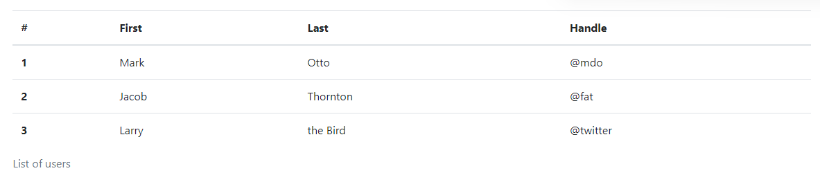
10. 回答フォーム
応答性の高いテーブルを使用すると、テーブルを簡単に水平スクロールできます。.table-responsiveでラップすることで.table、1 つのテーブルをすべてのビューポートで応答できるようにします。あるいは、次を使用して、.table-responsive{-sm|-md|-lg|-xl}応答式が到達する最大ブレークポイントを選択します。
垂直方向のクリッピング/切り捨て
レスポンシブ テーブルはこれを利用しoverflow-y: hidden、テーブルの下端または上端を越えるコンテンツを削除します。特に、ドロップダウン メニューやその他のサードパーティ製ウィジェットが削除されます。
10.1. トータルレスポンス
各ブレークポイントで、水平スクロール テーブルに使用します.table-responsive。
<div class="table-responsive">
  <table class="table">
    ...
  </table>
</div>
効果は次の図に示すとおりです。
10.2、ブレークポイント固有
必要に応じて使用して、.table-responsive{-sm|-md|-lg|-xl}特定のブレークポイントまでの応答性の高いテーブルを作成します。そのブレークポイント以降、テーブルは通常どおり動作し、水平方向にスクロールしません。
これらのテーブルは、レスポンシブ スタイルが特定のビューポート幅に適用されるまで壊れる可能性があります。
<div class="table-responsive-sm">
  <table class="table">
    ...
  </table>
</div>

<div class="table-responsive-md">
  <table class="table">
    ...
  </table>
</div>

<div class="table-responsive-lg">
  <table class="table">
    ...
  </table>
</div>

<div class="table-responsive-xl">
  <table class="table">
    ...
  </table>
</div>
効果は次の図に示すとおりです。